
Colour Guide: Choosing Colours for Print
Choosing colours for print can feel confusing, especially if you’re not a designer. Screens, printers, and inks all work differently, which means colours don’t always look the same once printed.
This guide explains the three main colour types you’ll see when ordering printed products and helps you choose the right one for your order.
This guide explains the three main colour types you’ll see when ordering printed products and helps you choose the right one for your order.
Quick guide: which should I choose?
- CMYK: best for most printed products
- Pantone: best when brand colours must match exactly
- RGB: for screens only, must be converted before printing
If you’re unsure, CMYK is usually the safest choice.

CMYK, full colour printing
CMYK stands for Cyan, Magenta, Yellow, and Black. These four inks mix to create most printed colours.
CMYK is ideal for:
CMYK is ideal for:
- Posters, banners, flyers, and leaflets
- Photos and gradients
- Most standard print jobs
Things to know:
- It’s the most common print method
- Colours may look a bit different from your screen
- Very bright or neon colours aren’t possible in CMYK
- Not ideal if you need an exact brand colour match

Pantone, exact colour matching
Pantone colours are pre-mixed inks with specific colour codes. Use them when colour accuracy is critical.
Pantone is ideal for:
Pantone is ideal for:
- Logos and brand colours
- Consistent colour across different products
- Special colours such as metallics, pastels, or fluorescents
Things to know:
- Pantone inks print as separate “spot colours”
- More accurate than CMYK for brand colours
- Usually costs more than standard CMYK
- Not needed for photos or general artwork
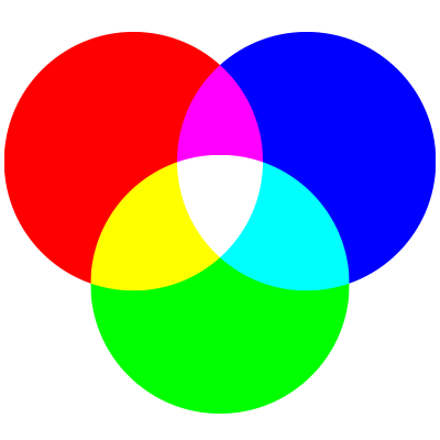
RGB, screen colours only
RGB stands for Red, Green, and Blue. Screens such as phones, TVs, and computers use RGB.
Important: RGB cannot be printed.
What this means:
Important: RGB cannot be printed.
What this means:
- RGB files must be converted to CMYK before printing
- Bright screen colours often look duller in print
- This is normal, due to how ink works
Why do printed colours look different from screens?
Screens use light. Printers use ink. Some bright onscreen colours simply can’t be reproduced with ink, so printers convert them to the closest match. Printed colours can look darker or less vibrant as a result.
Colour conversion, what you should do
If you’re not a designer
No problem. Upload your file and we’ll convert it for print. Just note that colours may shift slightly during conversion.
If you’re using design software
For best results:
No problem. Upload your file and we’ll convert it for print. Just note that colours may shift slightly during conversion.
If you’re using design software
For best results:
- Work and save your artwork in CMYK
- Convert any RGB images before exporting
- When exporting PDFs, avoid automatic colour conversion unless required
- If colour accuracy is critical, order a printed proof before full production
Common mistakes to avoid
- Uploading RGB artwork for print
- Expecting neon or glowing colours without Pantone inks
- Assuming screen colours will print exactly the same
- Using rich CMYK black for small text instead of solid black
Avoiding these helps your print look as expected.
Still unsure?
- Choose CMYK for most products
- Choose Pantone for brand-critical colours
- Ask us to check your artwork before printing
